Blog · Font cycle
How to make a video with cycling fonts
A font cycling video keeps one image and one line of text on screen while the typeface changes. The words stay in place. You can compare how a sentence feels in different typefaces or turn a still photo into a looping clip.
Open Font cycle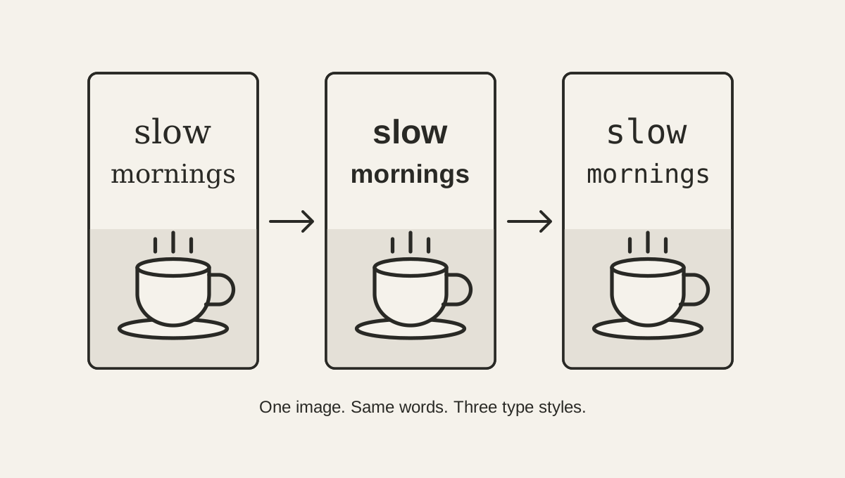
1. Choose an image that works in portrait
The export is a vertical 9:16 video. A portrait photo usually needs less cropping, while a wide photo is enlarged to fill the frame and may lose detail at the sides. Leave some calm space near the top for the words, and avoid placing the main subject where the text will sit.
The sample image below keeps the coffee cup low in the frame and leaves a darker background above it. That gives white text enough contrast without adding a separate text box.
2. Add a line people can read at a glance
Choose the image, then type directly over its preview. Keep the message short: the tool wraps longer text and reduces its size to fit, but a few words are easier to read while the font changes. The text field accepts up to 220 characters, though that is a limit rather than a useful target.
Check the text against both light and dark parts of the photo. The tool draws white text with a subtle shadow. If the words still disappear into the image, try another crop or choose a photo with a quieter background.
For a quote from an interview or voice memo saved as video, transcribe the clip and review the words before choosing a short line. Pair it with a still image that gives the quote context. Font cycle exports the image and text without audio, so a viewer needs to understand the line on its own.
3. Compare typefaces and set the rhythm
Open Fonts & timing to choose which faces take part. Font cycle includes sans-serif, serif, and monospaced options; the default selection already gives you a useful contrast. The interval setting controls how often the face changes, from 0.1 to 2 seconds. A slower change makes each style easier to compare, while a faster one feels more animated.
Preview the sentence with every selected font before exporting. Some typefaces are wider than others, so a phrase that fits on one line in a sans-serif face may wrap in a serif. Short wording keeps the position and size more consistent.
4. Export and check the saved video
Export creates a 60-second, 720 × 1280 WebM video with no audio. Keep the tab visible while it records, then play the result once to check that the text stays readable and the chosen fonts have loaded. The image and video rendering stay in your browser; the image is not uploaded.
This format is useful for a simple text-led post or a font comparison. If you need voiceover, music, multiple scenes, or precise timing against an existing clip, a timeline editor will give you more control.
Example output · 15 seconds
One sentence, three type styles
Play the preview, or download the sample image and make a version with your own words.
Download the sample image